Choose the app’s appearance and the map’s palette
App appearance and relationship-map colors gained separate theme choices.
Read MarkdownDates describe development history and do not verify when changes became available.
Development period: to
Pick an appearance alongside light or dark mode
addedappearanceAvailability: unverified
Choose an appearance theme separately from light, dark or system mode.
The five themes were Mono, Cream, Paper, Moss and Aubergine. The appearance choice and the light/dark mode remained separate settings.
Choose the map’s colors independently
addedappearanceAvailability: unverified
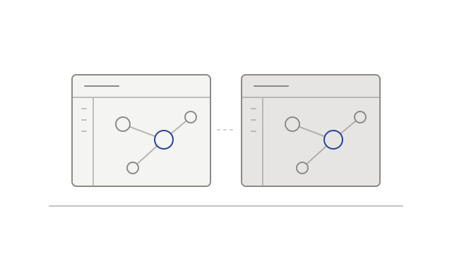
The relationship map gained its own theme picker with color previews.
Its previews showed colors for people, companies, projects and topics in the current light or dark mode. The map’s palette could be chosen independently of the app appearance theme.